The Olde Pink House
- Concept
- Brand Identity
- Hospitality
A rebrand for Savannah’s Olde Pink House, carrying a 1771 Georgian mansion’s candlelit charm from the printed menu to the screen.
Context
- Services
- Brand Identity, UI/UX
Independent redesign. Not commissioned by The Olde Pink House.
AboutThe Olde Pink House sits on Reynolds Square in Savannah, Georgia. Begun in 1771 and finished in 1789, it has been a family home, Georgia’s first bank, a bookstore and a tea room, and has served supper since 1971. Its walls turned pink as the red brick showed through the white plaster. The rebrand starts from the house itself: plaster pinks, oxblood and gilt, pressed specimens of azalea, teacup and teaspoon, and a script-and-serif type pairing taken from the printed menu.
Typefaces
Sloop Script
Baskerville URW
Helvetica
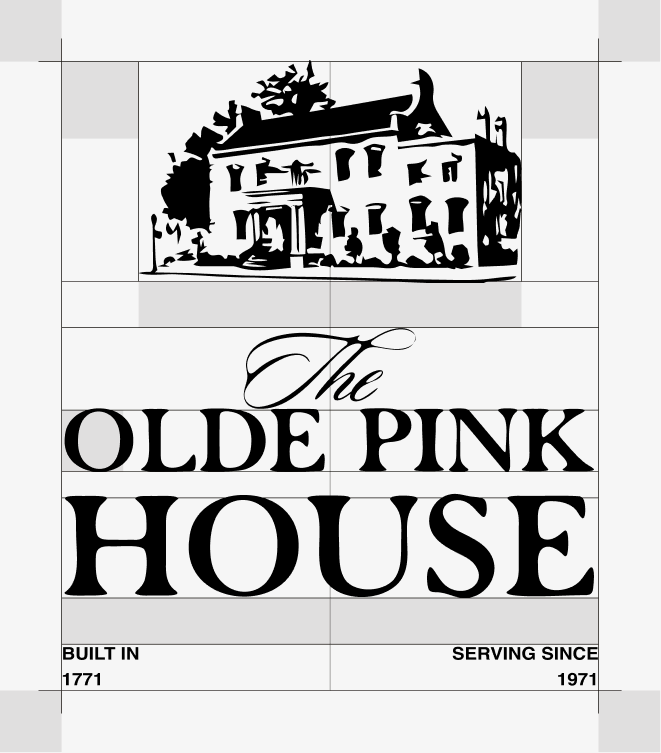
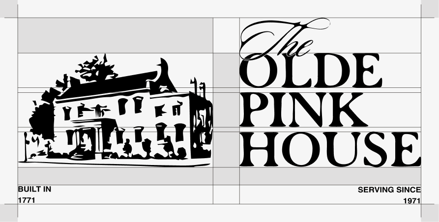
ProcessThe logo process started with keeping the heritage and history of the property at the forefront. Rather than inventing a new symbol, the mark is the house itself: a line drawing of the Georgian facade that sits above the name like an engraving. The wordmark pairs a script “The” with “Olde Pink House” set in serif capitals, echoing the script lettering on the sign above the front door. Two small dates complete the lockup, “Built in 1771” and “Serving since 1971”, holding both of the property’s histories: the house and the restaurant.
Color
Bone
#F3EADC
Ledger Ink
#241716
Blush
#F0CFC4
Plaster Pink
#E2A39A
Brick
#A6493C
Oxblood
#5C2128
Gilt
#DDA94C
Haint Blue
#A6CEC8

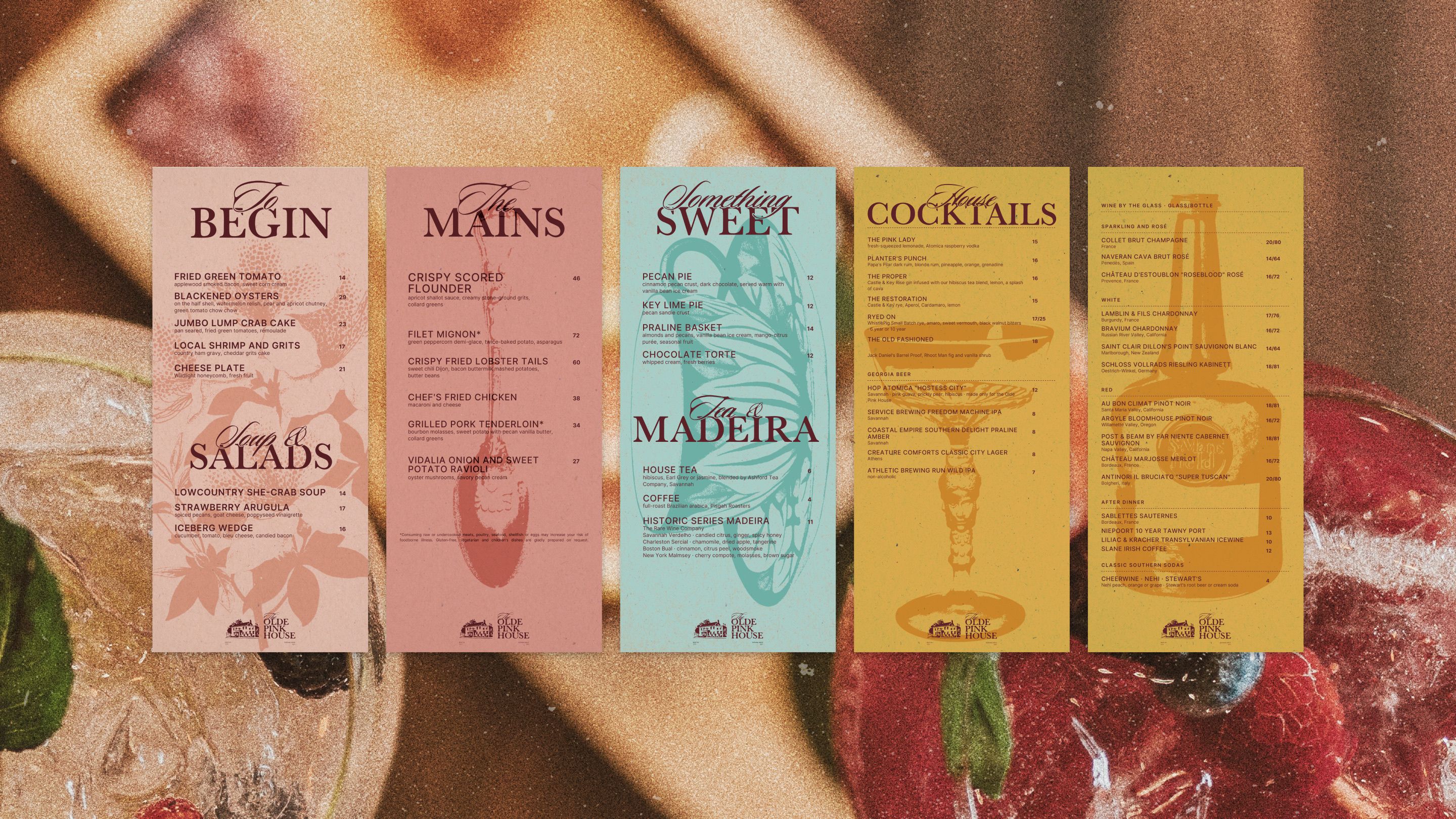
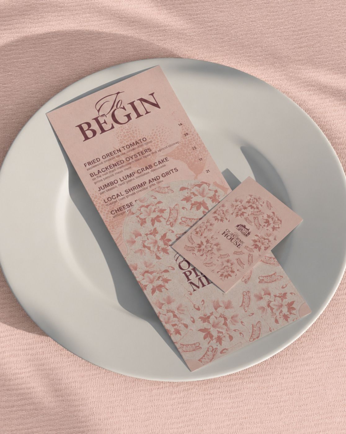
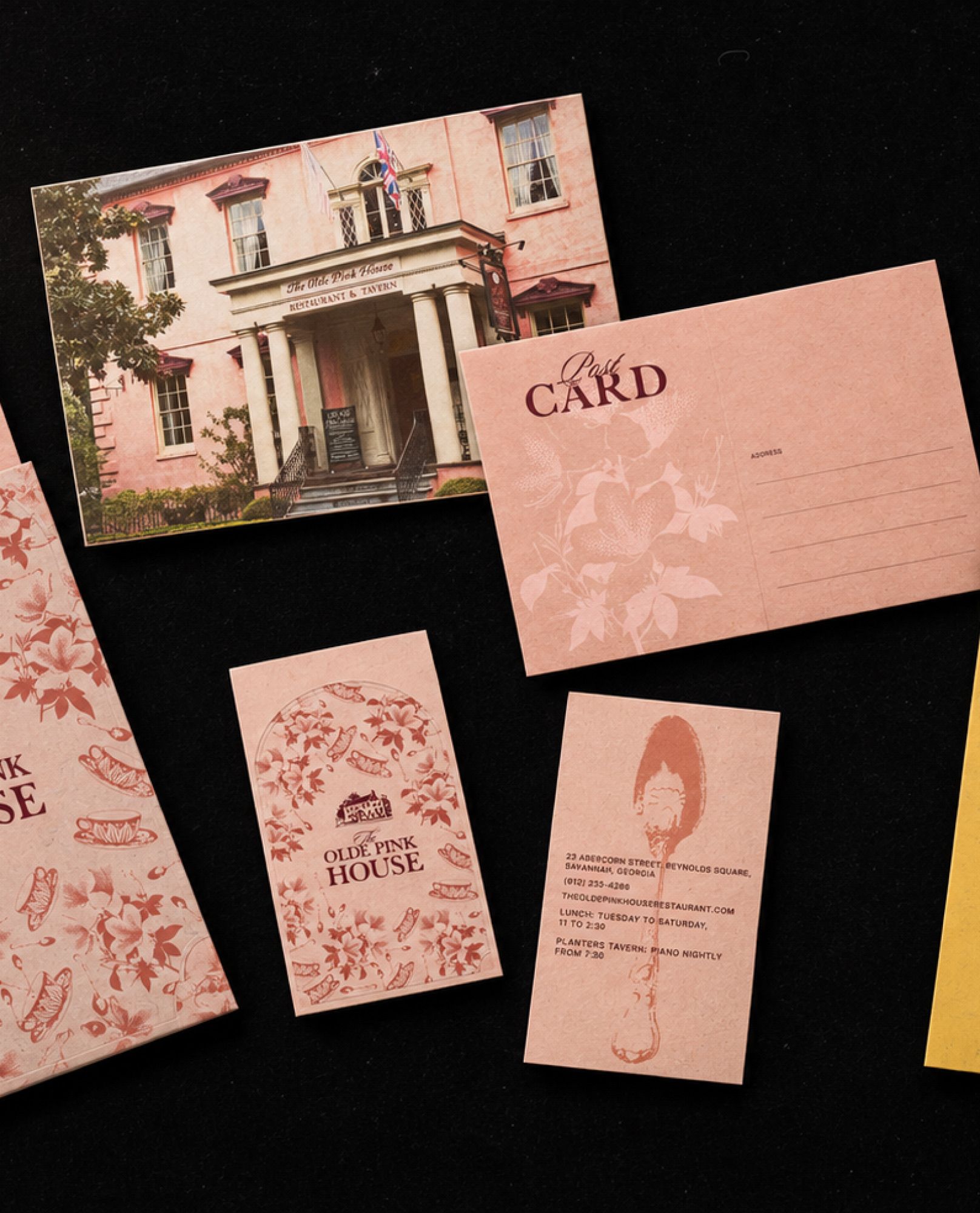
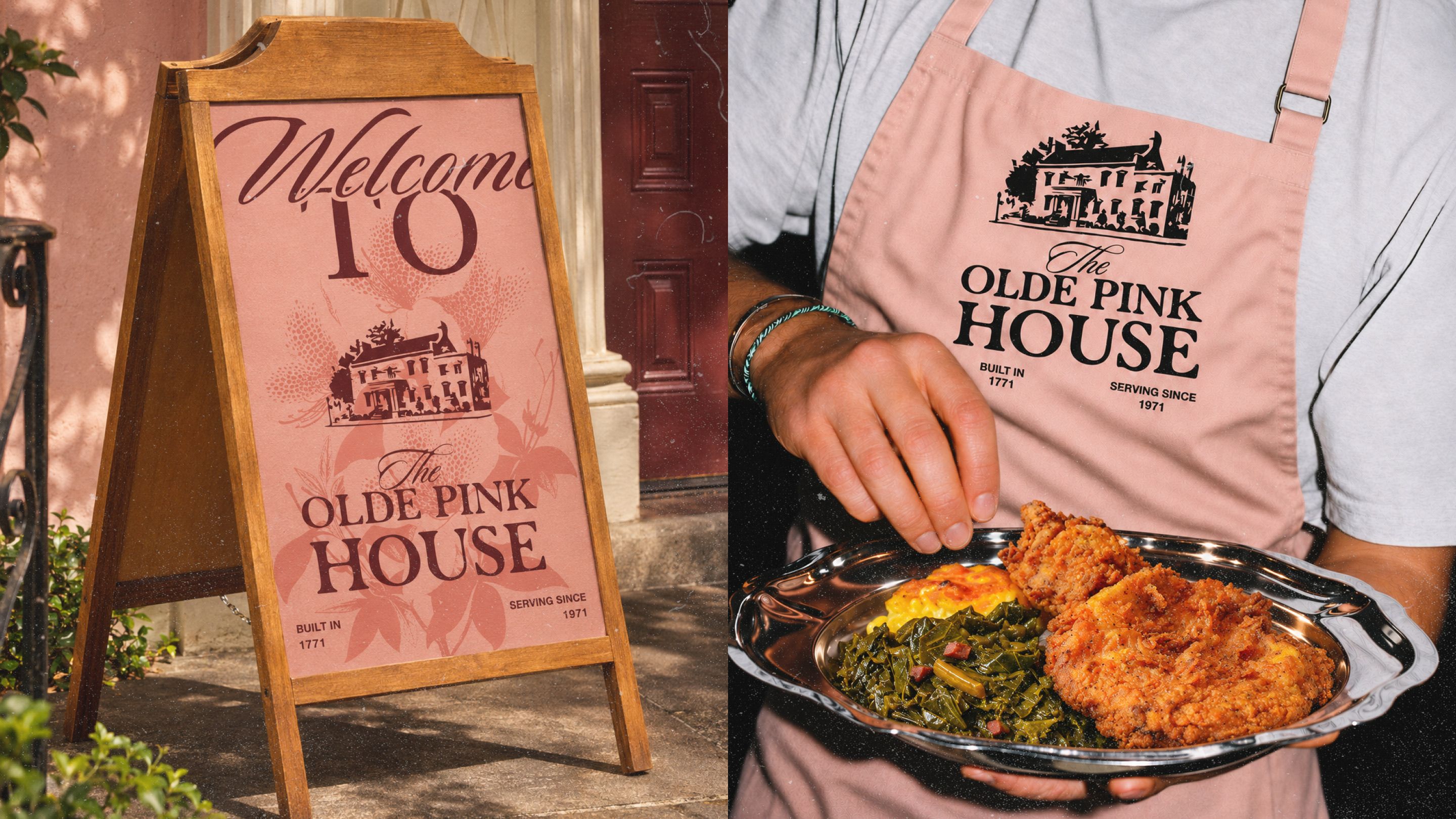
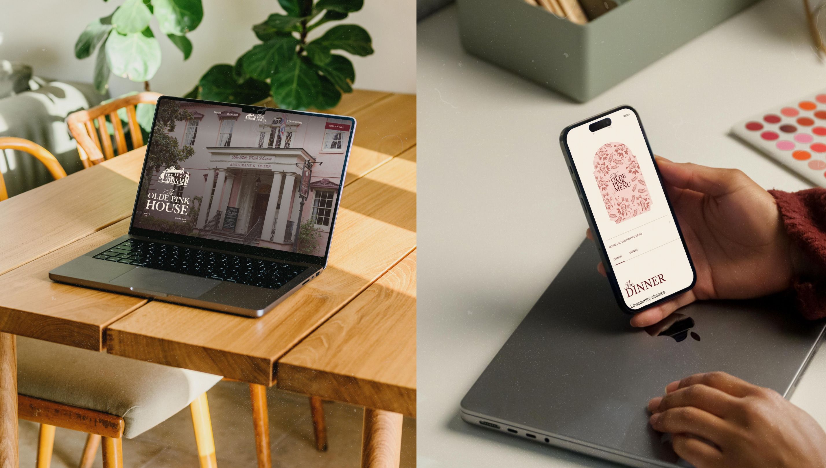
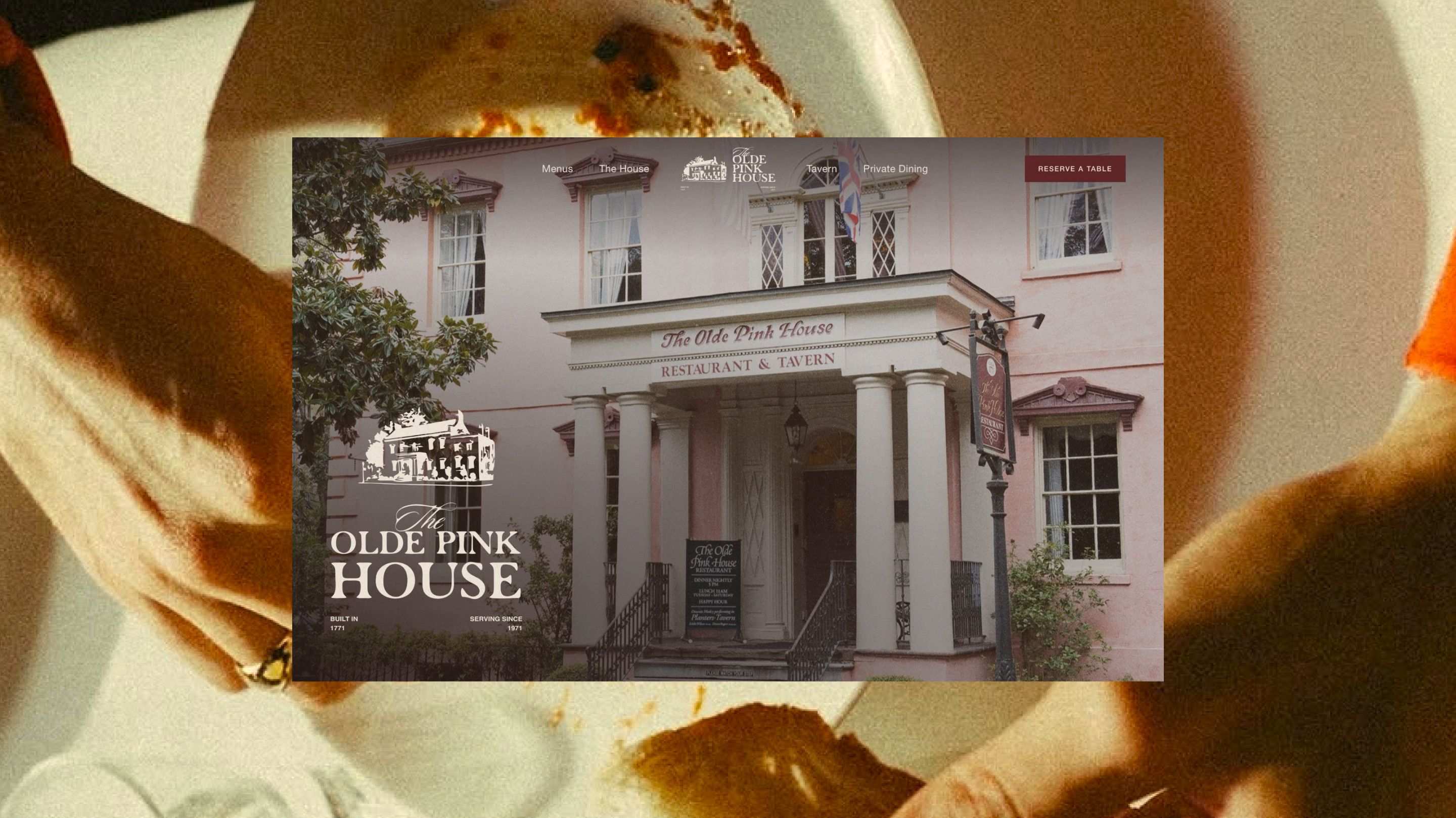
ProcessThe new Olde Pink House site takes everything the rebrand built in print and lets you walk through it. The plaster pinks, oxblood and gilt carry over, along with the script-and-serif titles and the pressed azalea, teacup and teaspoon. Menu cards slide out of the same patterned arch as the printed jacket, specimens appear beside dishes as you hover, and Polaroids of each room develop as you scroll, all under a soft film grain that keeps the pace slow and candlelit. Importantly, the site is built as a system, not a set of pages. Menus, hours and rooms each live in one place, so a new dish or a change to the hours updates everywhere at once, and the same components carry the brand from the Tavern’s dark rooms to the light upstairs dining rooms.